Game Size
Since Replay can deploy to multiple platforms, you likely want your game to work at various dimensions, sizes and orientations. Replay has a few tools to make this easier for you.
Game Coordinates#
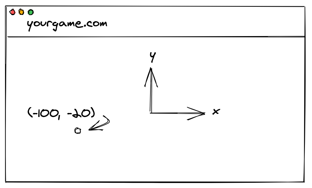
Your game must have a fixed width and height. This is unitless, not in pixels! You can choose any values you like. When you set the position of a sprite, you are setting it relative to your width and height. The origin (0,0) is in the center of the screen, and the y axis is positive upwards.
Safe Zone#
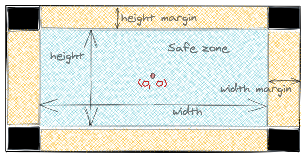
Your game can also set a margin beyond the fixed width and height to avoid black bars on resolutions that don't match your game's dimensions. Inside the margins is the safe zone where you should render the important visuals in the game. In the margins you can put non-essential visuals like wider backgrounds. Alternatively, you can calculate the total width and height of the device in your render method and position responsively.
Orientations#
Sprites have multiple render methods to deal with different orientations and resolutions, as mentioned in Sprites. Only one render method will be chosen based on your settings. You don't need to set them for every Sprite, if they're not present Replay will default to using just render.
size Game Prop#
Your Top-Level Game Sprite accepts a size prop:
size takes the following fields:
width: The width of your game, defines thexgame coordinates.height: The height of your game, defines theygame coordinates.minWidthXL: (Optional) Set this if you want to use therenderXLmethods when the device's width is beyond this value in pixels.minHeightXL: (Optional) Set this if you want to use therenderXLmethods when the device's height is beyond this value in pixels.maxWidthMargin: (Optional) Set to allow a margin on the left and right of game in game coordinates (up to this value).maxHeightMargin: (Optional) Set to allow a margin on the top and bottom of game in game coordinates (up to this value).
The example above is for a landscape-only game. If you want portrait-only simply set a height greater than the width.
If you want to support both landscape and portrait, size can accept an object with portrait and landscape fields like below. The orientation is chosen by Replay automatically.
If the screen is landscape, Replay will call render and renderXL (if defined). If it's in portrait, Replay will call renderP or renderPXL if they're defined instead.
device.size#
The size field in the device parameter of the Sprite methods contains properties you can use for layout:
Here's how you could render a game's score at the top of the screen on all devices: